I.D. Magazine, March/ April 1988, featuring “Typography as Discourse.” | image courtesy Print Magazine
The CalArts Graphic Design program is featured in the Spring 2017, California-focused issue of Print Magazine. Writer Rick Poynor recounts the history of the Institute’s Graphic Design Program, and how it “redefined what young designers were capable of—and electrified the field in the process.”
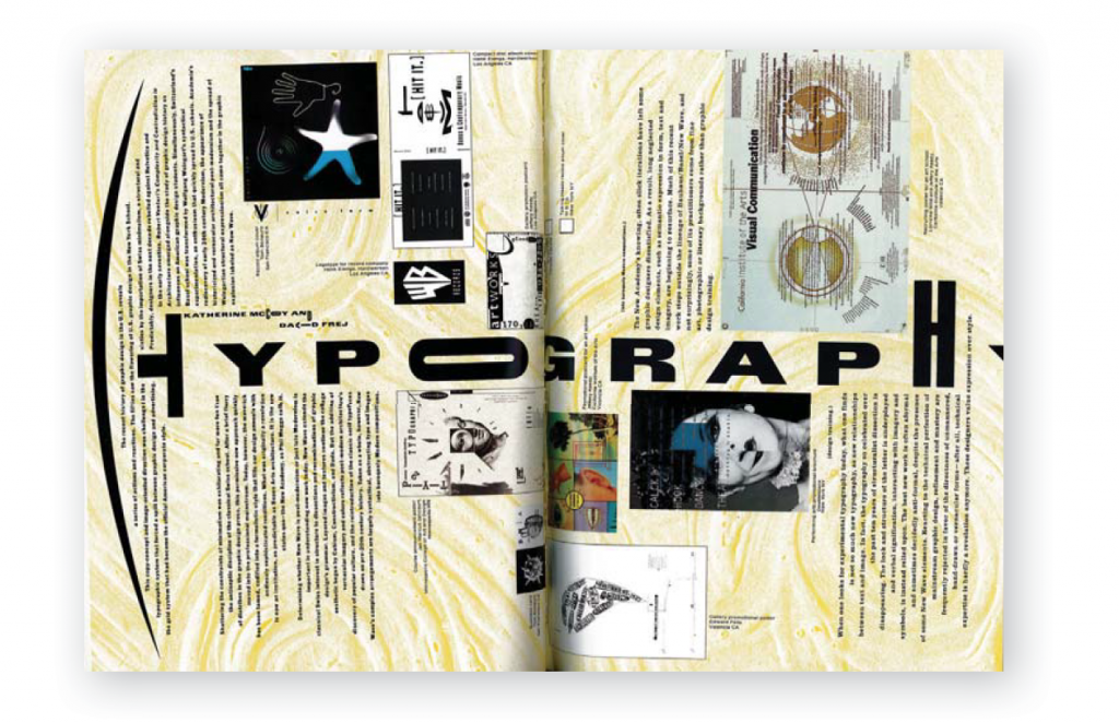
Poyner recalls his first introduction to graphic design at CalArts in the late 1980s when designers Jeff Keedy, Ed Fella and Lorraine Wild ran the program. All graduates of Cranbrook Academy of Art, the three brought with them their alma mater’s spirit of experimentation, which established “tight social and intellectual bonds between Cranbrook and CalArts.” Poynor writes that together “they formed a formidable trio and went on to achieve a high profile on the design scene both for the program, and as influential educators and designers.”
Wild’s essay on design education for the 1983 edition of Design Journal helped to land her the position at CalArts, and also define the ethos of the program for years to come. Poynor writes that Wild’s paper challenged many of the graphic design programs at the time because she argued they “were not responding to the growing sophistication of the field.”
The article continues:
‘If we expect a student to ‘make form a meaningful thing,’ Wild wrote, ‘then the student has to understand, in the first place, the importance of meaning, and secondly, the means by which meaning is conveyed.’ She insisted, ‘students must see themselves within the historical continuum of visual and verbal communicators.’
This is evident in the program’s strong foundation courses, History of Graphic Design and Design Theory, which give greater meaning and context to every design decision students make in their compositions.
The Print Magazine article points out that work created at CalArts, such as the archive of REDCAT posters, possesses an “extreme whimsy in the placement of fonts, often from perse families and in several different sizes. What appears completely anarchic is in fact thoroughly thought out.”
As Poynor says, in contemporary design programs throughout the world, “capricious type choices and knowingly misplaced graphic paraphernalia have become a familiar routine.” However, the deliberate rule breaking born at CalArts was truly revolutionary for its time and has become an essential component in the lineage of West Coast graphic design.